A Darker Shade of Pale: The Hidden History Beneath New England’s White Paint
Learning to see a full spectrum of history in a can of white paint.
By Howard Mansfield|Jun 28 2026|

A Darker Shade of Pale
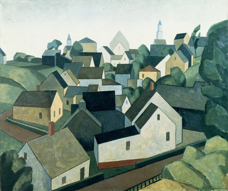
Credit: Art Resource, NY, Painting by Niles Spencer, Back of the Town (Provincetown), 1926, Private CollectionThat New England photo you love—the one of the meetinghouse on the common with a white spire against a blue sky, or the one of the white farmhouse with green shutters from 1819—well, that photo is a bit of a lie. Our region’s white-painted buildings conceal an evolution in taste, and in chemistry.
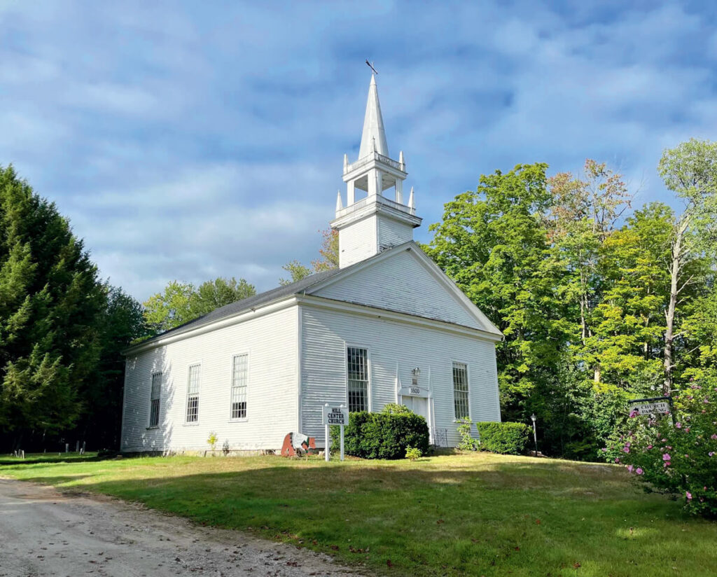
Scrape an old clapboard and you may uncover this history, just as the trustees of the Hill Center Church, in Hill, New Hampshire, have learned. They were nearly done with the restoration of their church, built in 1800, when their painter stumped them by asking them what shade of white they wanted. As anyone who’s ever been in a paint store knows, there are a confounding number of varieties: Benjamin Moore’s Off White Collection offers 152 shades, including White Christmas, Vanilla Milkshake, Snow White, Easter Lily, Picket Fence, Grandma’s China, and Chantilly Lace. Or maybe you want Simply White. Sherwin-Williams also sells more than 150 shades, including Extra White, Greek Villa, and White Duck. Examining those bookmark-sized color samples, comparing Meadow Mist with Mirage White, you are a white mouse in a maze of white-painted walls.
But these are contemporary editions of the color white, not the historically accurate color the Hill Center Church was seeking. The white paint that New Englanders adopted in the 19th century is not the crisp, brilliant white we know. To us, their white exteriors would seem dirty, dim, and yellowish. It was “off-white,” a muted color that might prompt today’s homeowners to apply new paint. Inside, a white the shade of doves or oyster shells was popular.
House painters of yore bought raw materials to mix their own paint, blending linseed oil, lead powder, and pigments like white chalk, resulting in off-white, or whites with a yellowish cast. To create “Pearl,” for example, Hezekiah Reynolds’s 1812 guide Directions for House and Ship Painting prescribed: “To one pint of white Lead add one teaspoonfull of Prussian blue; and one teaspoonfull of Spruce Yellow, or in that proportion.” Premixed paint sold in cans came along in the second half of the 1800s. Another change, the common use of boiled linseed oil, which dried faster, had an even deeper amber, lending more yellow to white walls.
In the early days of the republic, white lead paint, which was expensive, had status. A white house was a sign of prosperity. “White was more than a fashionable color,” wrote historian John R. Stilgoe. “It was new, completely new, as new as a democratic government free from Parliament, and men and women embarking on the experiment in nationhood embraced it passionately…. White lead paint announced a new country.”
Even so, it wasn’t adopted for every building. Meetinghouses, once towns got around to painting them, were a rainbow: yellow, gray, sky blue, red, bright orange, peach blossom, and—the choice of Ashburnham, Massachusetts, residents—pea green. Pomfret, Connecticut, voted in 1762 to paint its new meetinghouse orange with “the doors and bottom boards of a chocolate color—the windows, jets, corner boards and weather boards, colored white.” And Hampton, Connecticut, voted in 1805 for a “roof and backside red, the foreside and ends of a Stone yellow, the window frames white, the doors and bottom boards of a chocolate color.”
Credit: New Hampshire Preservation Alliance
But that colorful history was, you could say, whitewashed. With the advent of the Colonial Revival period around the 1880s, white became New England’s uniform. And then in 1921, white paint became even whiter. Titanium dioxide was added to white paint, creating what we think of as white today. There was no going back. It was the equivalent of the arrival of teeth-whitening treatments. The classic New England calendar image could be labeled “Brought to you by titanium dioxide.”
Paint colors are fashion. They change radically. (There’s the mauve and deep greens of the late Victorian era, and the paisley wallpaper and avocado-green refrigerators of the 1960s and ’70s.) Fashions come and go; paint colors are “fugitive,” say restorers. They fade, get covered over, and vanish from the record, leaving mysteries on every wall. Early paint colors—bright blues, yellows, and greens—were made with “fugitive” pigments that dulled over the years. They were temporary colors. History, too, and life itself, is “fugitive.”
A major change in our surroundings has slipped by, becoming standard without us noticing. It’s as if we changed the length of a universal measure, the foot, and forgotten that we’re referring to a new measure. A paint chip can be a lens we use to see the rich history around us.
The Hill Center Church, seeking its way out of the white-on-white maze, turned to the New Hampshire Preservation Alliance for an answer. “The paint color was likely an off-white,” said the preservationists. “The level of ‘off’ is up to you. If your board is adventurous or interested in the most accurate color, shoot for something like Benjamin Moore’s Indian White,” which is a light tan or beige. “If that’s too different, work with your painter to find a happy medium.”
In short, as “off white” as you dare. They settled on a color that is grayer, Benjamin Moore’s White Dove. That was in July 2023. Today, says church trustee Frank Razzaboni, it’s “still perfect.”
This feature was originally published as “A Darker Shade of Pale” in the July/August 2026 issue of Yankee.