


ABC Mural of Local Distinctiveness | The Gift of a Sense of Place
“Wow—look at all that blue sky! You didn’t put in any of our grey winter clouds,” June Pichel Cook, the local reporter noted as she assessed the new mural, its paint still wet. “Yes, this is an idealized version,” Sarah Mutrux, the Art House’s executive director replied, “but we feel it celebrates the best aspects […]
Volunteer Fire Detail of the Craftsbury Alphabet of Distinctiveness Mural (or said more simply: a community selfie)
Photo Credit : Julia Shipley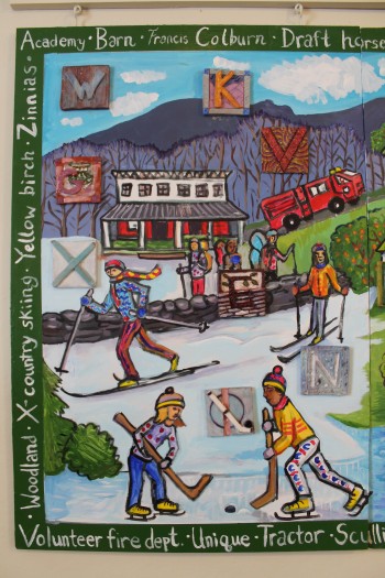
Photo Credit : Julia Shipley
“Wow—look at all that blue sky! You didn’t put in any of our grey winter clouds,” June Pichel Cook, the local reporter noted as she assessed the new mural, its paint still wet.
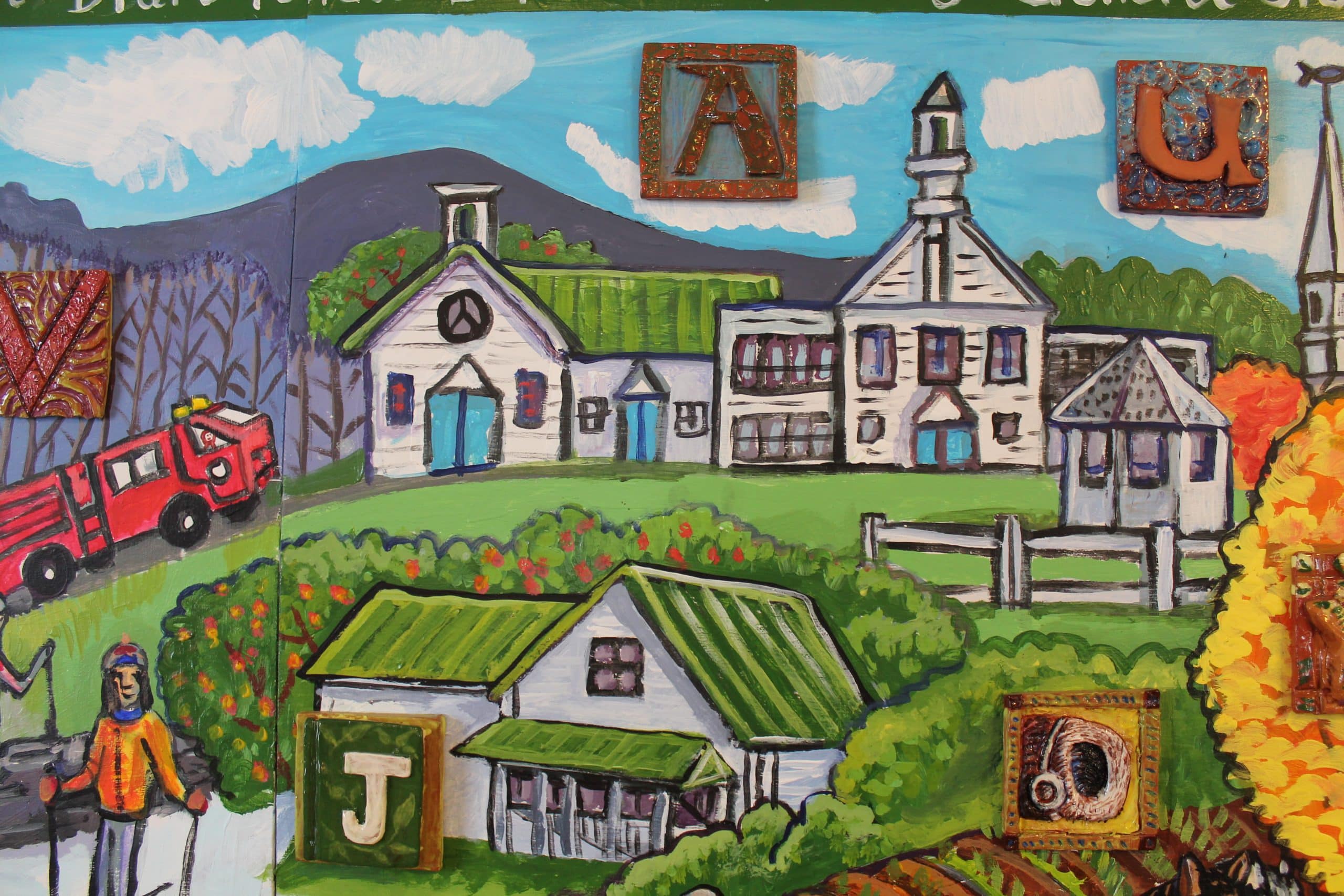
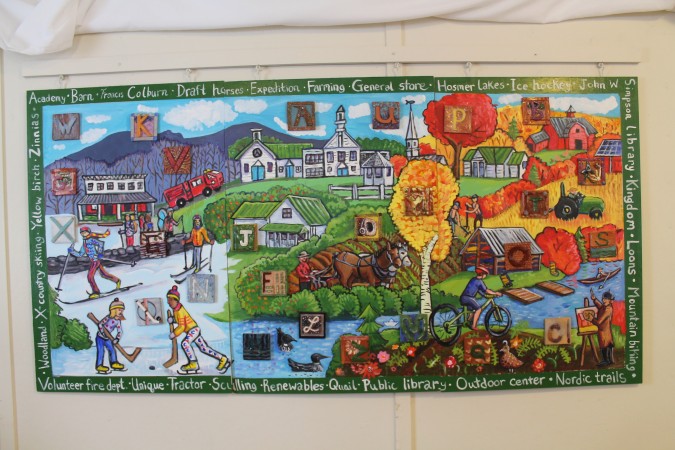
“Yes, this is an idealized version,” Sarah Mutrux, the Art House’s executive director replied, “but we feel it celebrates the best aspects of this place, and what makes it special and unique.” Sarah was speaking on behalf of the more than 100 people–from age two to ninety something, and from “just moved here last week” to “lived here all my life” — who contributed to this ABC mural of local distinctiveness.
Just about the time Yankee’s ABCs of Autumn issue was hitting the stands, people in Craftsbury, Vermont, were just starting to bear down on the finer points of an alphabet that best describes not only a season, but a town, a six mile by six mile hunk of land that a thousand folks call home. Should “B” stand for Bull’s Eye Granite—the rare geological “orbicule” formations found in the rocks out by the Town Garage? Or should “B” stand for Brown’s Beautiful Blueberries—a local pick-your-own operation so bountiful, I’ll wager half the town has gallon or more stocked away in their freezer. Maybe “B” should stand for our Black River, which swerves back and forth through the village like someone having drastic second thoughts. This conversation played out on fill-in-the- blank questionnaires left out at the town Library, the Historical Society and the Art House, until finally they were gathered up and selectively illustrated by children in Sarah’s art classes as well as two of the town’s fine artists, Kristin Urie and Viola Reil.
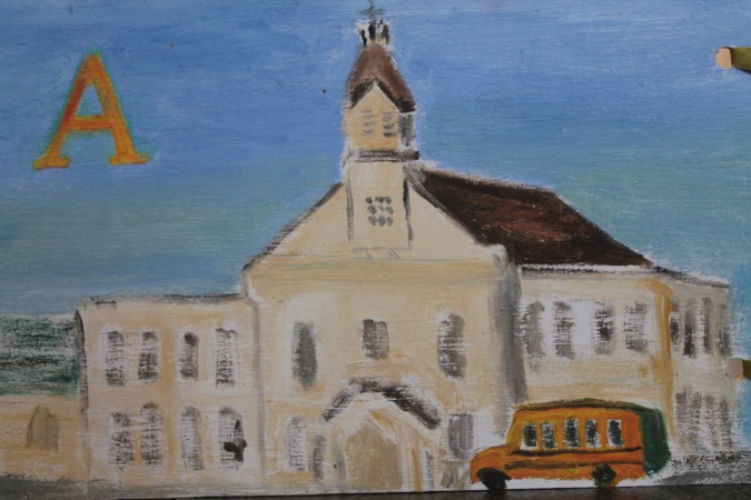
Photo Credit : Julia Shipley
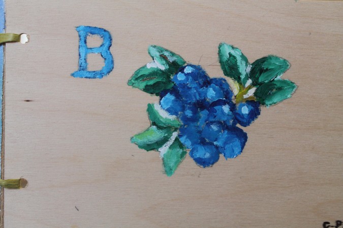
Photo Credit : Julia Shipley
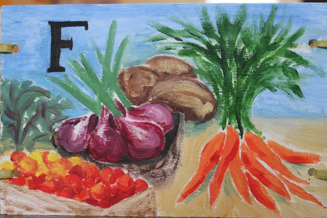
Photo Credit : Julia Shipley
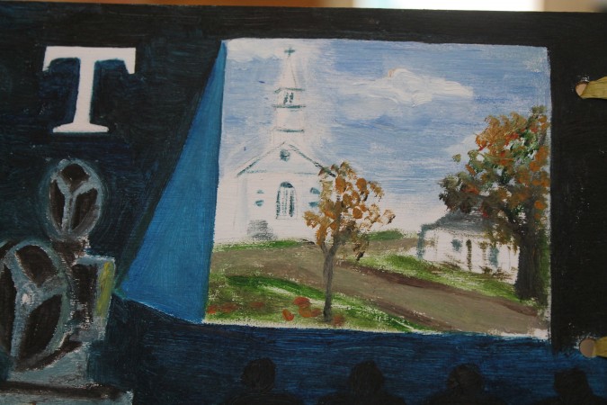
Photo Credit : Julia Shipley
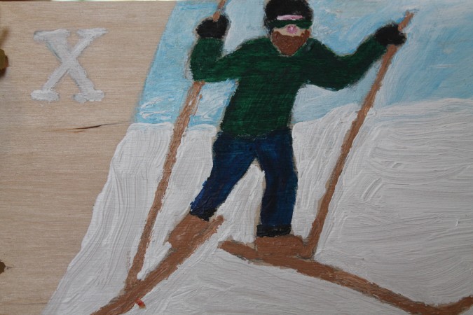
Photo Credit : Julia Shipley
Last, muralist Tara Goreau sat down with Sarah Mutrux to sketch out a three panel tableau combining all the possibilities. The resulting mural features the changing seasons and illustrates some of Craftbury’s distinct cultural, historical and natural features with additional alphabet ideas framing the edges. Over the summer the Art House held three “Come and paint it!” days for the community to color in Tara’s outlined designs. Then Heather Stearns of Muddy Creek Pottery held a tile making workshop where participants formed and embellished each letter. Finally, all these elements—words, images and tiled letters coalesced in the handsome “selfie” of Craftsbury, Vermont, the result of a hundred hands. And it hangs on the back wall of the Art House, radiating plenty of color to cheer us though some of winter’s cloudy days.
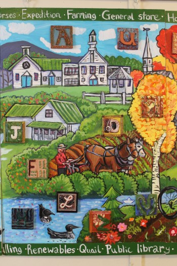
Photo Credit : Julia Shipley
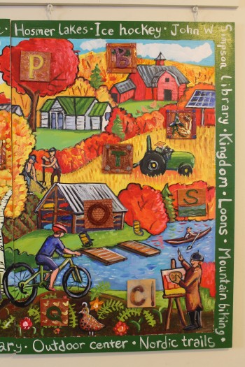
Photo Credit : Julia Shipley
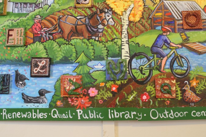
Photo Credit : Julia Shipley

Julia Shipley
Contributing editor Julia Shipley’s stories celebrate New Englanders’ enduring connection to place. Her long-form lyric essay, “Adam’s Mark,” was selected as one of the Boston Globes Best New England Books of 2014.
More by Julia Shipley