Homes
Cottage Addition on a Budget
When graphic designer Carol Kolodny built her cottage in Vineyard Haven in 1981, she had plenty of room for herself and could accommodate her nephews on their frequent visits. But some 20 years later she was feeling crowded, particularly when company came calling, as it often does for residents of Martha’s Vineyard. “My brother joked […]

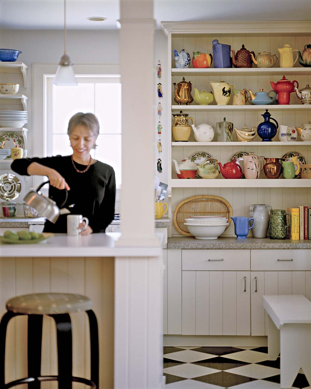
A collection of teapots decorates Carol Kolodny’s kitchen shelves. Flea market finds and gifts, the colorful pieces serve as reminders of good junking days past.
Photo Credit : Partenio, MichaelWhen graphic designer Carol Kolodny built her cottage in Vineyard Haven in 1981, she had plenty of room for herself and could accommodate her nephews on their frequent visits. But some 20 years later she was feeling crowded, particularly when company came calling, as it often does for residents of Martha’s Vineyard.
“My brother joked that the boys might have to leave their enormous sneakers in the driveway because my house was so small,” says Carol. “I wanted them to know they were always welcome, so I decided to renovate.”
The result is an additional 650 square feet of living space that accomplishes a number of her goals:
A big porch. “There is nothing I enjoy more. A whole space you hardly have to clean, never have to heat, that puts you really outside but also inside.”
A first-floor master bedroom and bath. “What can I say? I got old.”
A new kitchen. “I’ve been sitting around dreaming of it for 20 years. I wanted a bigger, better kitchen — with a dishwasher!”
The renovation also included a living room fireplace and built-in shelves, a tidy basement that replaced a dirt crawl space, and a money-saving change from electric heat to gas/hot water heat.
Before completing the design, which was a collaborative effort with residential designer Margaret Curtin, Carol recalls, “I was a menace with a measuring tape. When I was in spaces I liked, old or new, I analyzed and detailed what I liked about them. New houses are missing the quirks that make old houses so charming and fun. When you are paying a small fortune, it is hard to incorporate the surprises and odd spaces that make a space delightful.”
Carol completed her project with a keen eye on the budget (total expense $200,000). “You have to decide which things mean the most to you. For example, most of my furniture comes from thrift shops and yard sales. I did more paint stripping and repainting and re-covering than I’d like to remember.”
She also made some compromises. “I talked myself into being OK with laminate instead of solid-surface counters, and I actually prefer warm, soft linoleum to cold, loud tile.
“I did have a big table made for my dining area after the renovation, partly because the dining room is really central to the house. The table was made of old pine so it would already have a patina and I could use it as a worktable. It has a shallow apron so you can cross your legs under it.”
Carol’s interest in home design and use of space reflect not only her training as a graphic designer but her heritage, as well. Both her mother, Evelyn, and aunt Charlotte were forward-thinking people. “When my mother painted the knotty pine in our obnoxious suburban split-level white, I thought we would be run out of town,” Carol says with a smile.
“And my aunt Charlotte made truly amazing houses. She took an 1800s farmhouse and filled it with great antiques and some fabulous modern furniture and art, and ended up with a house that has become almost mythological in my family for its comfort and beauty.” Like her predecessors, Carol practices what she calls thoughtful breaking of the rules. “I most enjoy making spaces unique, but not impractical. If the shelf is too high, the window too small, the counter too shallow to roll out cookies on, the space can’t feel good. A house is like a pair of jeans — not so cute if you can’t sit down in them or the wind whistles up your shins.”


