How To
How to Photograph Architecture | Steeples, Sugar Shacks, and Skyscrapers
I love winter. I follow the storms, arriving in recently-snowed-upon towns before they’re properly plowed, shooting winter villages through a lace of fresh fluff on branches, picturing woodlands and villages with a thick frosting of ice. Other photographers are showing us the first sprouts of spring, but my bags are still packed for the next […]
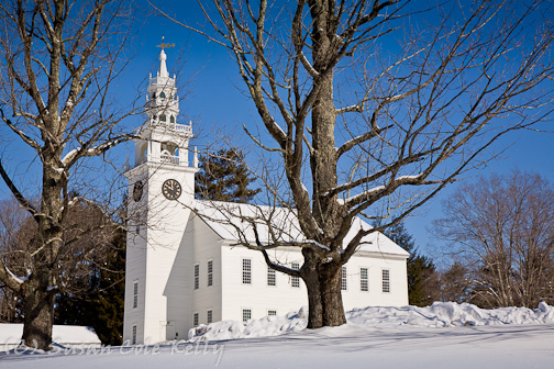
Photo Credit : Kelly, Susan Cole
I love winter. I follow the storms, arriving in recently-snowed-upon towns before they’re properly plowed, shooting winter villages through a lace of fresh fluff on branches, picturing woodlands and villages with a thick frosting of ice. Other photographers are showing us the first sprouts of spring, but my bags are still packed for the next snowstorm.
Nevertheless, it is March, and at some point even I will make the transition to reality. Suddenly I’ll become aware of the drabness of my surroundings. The magical North-country winter will lose its allure. But I will still need my fix of beauty, and New England spring is a long time coming.
But the bare season is just right for shooting my favorite buildings. I noticed long ago that architectural photographers often take pictures before the trees leaf out, to get a clear view and show their subject’s best features. So, sometime this month, I’ll start taking my trusty camera into the city and playing with shiny glass facades in the financial district and stately historic structures along the Freedom Trail. My fascination for architecture doesn’t stop here. I love lighthouses, country churches, historical museums and general stores. After all — buildings aren’t just things we see. They’re our homes, our sanctuaries, and our front to the world. They can be strictly utilitarian or they can express our aspirations. Just as the design of Lincoln Memorial stirs feelings of awe, the sight of a log cabin in the woods makes us feel at home.
Let’s stipulate that we aren’t going anywhere with exotic architecture this week. There are plenty of reasons to photograph buildings in your own town. You may want to make a beautiful portrait of your home as a memento, or photograph a neighbor’s house as a gift. A framed print of a nearby church could bring them income at a raffle. A picture of a quaint local drugstore could be one of your best-selling images. You could be doing real estate photography. Or you could make pictures of an area to document it or to keep a record of your travels.
My library contains several books on architectural photography, and they’re all pretty scary — technical diagrams of lenses, mathematical explanations of lighting fall-off, special effects, and more rules than I can count. The horizon MUST be horizontal and all vertical lines in a building MUST be truly vertical. People can be included only as design elements, but a cat curled up on a bed is much better. I don’t always follow the rules, and sometimes I take casual snapshots of buildings, but I do like to know how to do something right before deciding to add my own style to it.
My goal in taking a picture of architecture is to show the building’s features as they are, without introducing any weird effects created by my camera. I want to include any features that add to your experience of the building without including any distractions. That being said, sometimes it’s more creative and interesting to choose an eccentric angle to show the building’s use or its artistic design.
There are lots of Do’s and Don’ts in architectural photography. I’ll tackle the negative stuff first.
 Here I climbed up on a big snow bank and included more of the foreground to make the back of the camera vertical. Note that this angle also improved the exposure (lightnes/darkness) by excluding some of the bright sky. It would be great to have an attractive foreground, but I can crop out the road and have a good image. I know of several ways to fix perspective distortion:
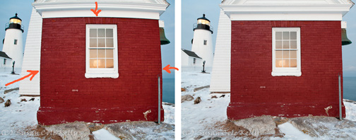 The left photo of the oil house at Pemaquid Point makes it look like a beach ball. The sides and top are bowed out instead of being straight. Barrel distortion is caused mostly by wide-angle lenses, so try to back up and use a longer lens. You could also fix the picture with photo editing software like Lightroom, as I did on the right.
Light and shadow:
Harsh shadows are a problem in any image, including architectural photography. Because cameras can’t handle contrast as well as our eyes, a picture will lose detail in either the highlights or the shadows or both. If you’re shooting a cathedral, you don’t want to lose the gargoyles in the shadows!
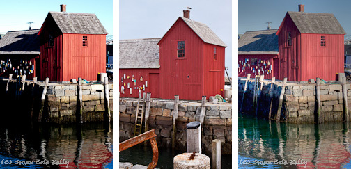 The picture on the left has a pretty blue sky, but the shadows have swallowed the detail of Rockport’s Motif #1 fishing shack. The middle image was taken on a cloudy day, and has excellent detail on all sides. The third photo is a tonemapped (software-enhanced) version of the first picture. Here are my suggestions for getting good light in your architectural photos:
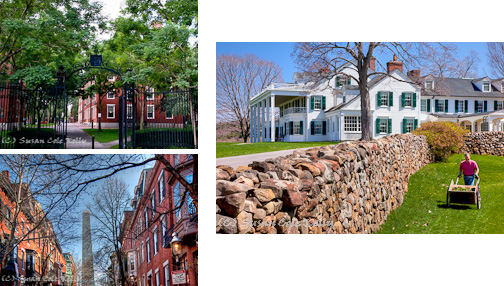 The first picture shows how trees can obscure the view. The other two show bare branches which allow a clear view of the subject. The white house, actually the Hill-Stead Museum in Farmington, CT, is my favorite because it was taken in April, when the trees were starting to have red buds and delicate, golden leaves. Early spring color breathes life into a scene.
Junk:
Traffic lights and phone poles are just a mess. Wires clutter sky and subjects. And signs block the view. Try to find an angle that minimizes these distractions. If I’m working with a partner, I will stand in the middle of the street to avoid wires. Or I’ll try the view from the back of the building. Sometimes I go to the second floor of a building across the street to get above the obstructions. If I can’t eliminate them all, I try to place wires in an empty patch of sky, where I can remove them later.
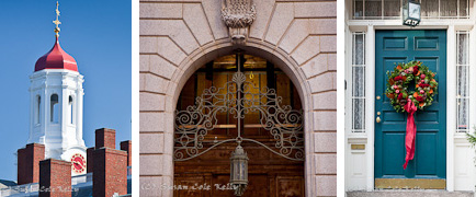 Age: Historical buildings often have a presence far beyond their original design. They may have beautiful details or be sturdy and utilitarian. They may show the footsteps of hundreds of factory workers or the tarnish of a timeworn farm. Think of the spacious rooms of a turn-of-the-century mansion. Can you envision it when it was young? Can you show the fine dining room, the maid’s quarters, the state of the art kitchen? This is where you use your imagination.
Style: Contemporary buildings are usually shot in a soaring, contemporary style. Highlight any unusual angles or textures or reflections, since they are part of the design. If you’re shooting a Georgian colonial, show its symmetry and solidness. A Victorian cottage has Gothic details and bright color. Each style of architecture has features which can be emphasized.
 Environment: Show enough of the surroundings to inform, but not enough to distract. If an old stone wall is integral to a property, include it. A garden might say more about a home that its shape. If there’s a gorgeous view, show it.
 Here, the focus of the log cabin is its spectacular view of Rangeley Lake. The owner of the house on the right is such an avid gardener that showing the house without its flowers would be shame.
Emotion: How does the building affect you? Stately? Grand? Celestial? Cozy? There are often many ways to depict a subject. Try to find a way to express the way it feels to you. Honor those who built and used it.
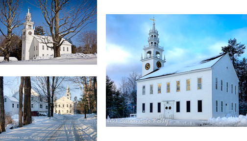 This church in Jaffrey Center, NH, is one of my favorite buildings. It has beautiful form and symmetry, and I love the care with which it was created. The exquisite steeple reflects the worship that took place within. I try to find new ways to portray it whenever I’m in the area.
I’m looking forward to my next trip to Boston. There’s a long list of landmarks I should shoot. But for now, my bags are packed, and there’s fresh snow in Vermont. See you later!
All photos © Susan Cole Kelly.
The Don’ts of Architectural Photography
Here’s my list of problems and suggestions on how to overcome them. Crooked axes: Remember the rules? The horizontal and vertical axis of your photo should be straight. If they aren’t, none of the other lines in your photo will be straight. As long as your vertical axis (center line) is truly vertical, you can fix many other problems in the computer. Perspective Distortion: Perspective distortion, created by cameras and lenses, makes buildings seem to lean inward. Most of the photos we see have this problem. In fact, we’re so accustomed to seeing it that we think it’s normal. But your eyes don’t see buildings leaning toward the center; it’s your camera. Perspective distortion comes from pointing the camera upward. You need to keep the back of the camera parallel to the surface you’re photographing. Here I climbed up on a big snow bank and included more of the foreground to make the back of the camera vertical. Note that this angle also improved the exposure (lightnes/darkness) by excluding some of the bright sky. It would be great to have an attractive foreground, but I can crop out the road and have a good image. I know of several ways to fix perspective distortion:
- Buy a DSLR and an expensive tilt-shift lens. Better yet, buy a very expensive large-format camera with tilts and shifts built into the camera, like the professional architectural photographers. Ouch, my aching wallet!
- Shoot it as well as you can and fix it with photo editing software like Lightroom, Photoshop, or Gimp (it’s free).
- Don’t use a wide-angle lens if possible. Instead, step back as far as you can and zoom in. This will eliminate much of the distortion introduced by wide lenses.
- Find a higher position. Stand on a snow bank or the second floor of a nearby building or parking garage to reduce the tilt of your camera.
 The left photo of the oil house at Pemaquid Point makes it look like a beach ball. The sides and top are bowed out instead of being straight. Barrel distortion is caused mostly by wide-angle lenses, so try to back up and use a longer lens. You could also fix the picture with photo editing software like Lightroom, as I did on the right.
Light and shadow:
Harsh shadows are a problem in any image, including architectural photography. Because cameras can’t handle contrast as well as our eyes, a picture will lose detail in either the highlights or the shadows or both. If you’re shooting a cathedral, you don’t want to lose the gargoyles in the shadows!
 The picture on the left has a pretty blue sky, but the shadows have swallowed the detail of Rockport’s Motif #1 fishing shack. The middle image was taken on a cloudy day, and has excellent detail on all sides. The third photo is a tonemapped (software-enhanced) version of the first picture. Here are my suggestions for getting good light in your architectural photos:
- Shoot on a cloudy day or a day with hazy sunshine to soften the shadows. This is by far the easiest way to get a good exposure. Or shoot at dusk or dawn for a romantic look with soft shadows.
- Observe your subject at different times of the day and take note of the direction of the light. Choose weather and a time that makes the building look good.
- If you must photograph in sunshine, try to include only the sunlit sides of the building. Or try to include only the shaded sides. The problem happens when you try to combine bright and dark.
- Software such as Lightroom and Photoshop can reduce the contrast in the computer.
- Take three bracketed exposures (one normal, one dark, one light) and combine them with HDR software in the computer. If you have only one exposure, HDR apps may still be able to improve the exposure with tonemapping.
 The first picture shows how trees can obscure the view. The other two show bare branches which allow a clear view of the subject. The white house, actually the Hill-Stead Museum in Farmington, CT, is my favorite because it was taken in April, when the trees were starting to have red buds and delicate, golden leaves. Early spring color breathes life into a scene.
Junk:
Traffic lights and phone poles are just a mess. Wires clutter sky and subjects. And signs block the view. Try to find an angle that minimizes these distractions. If I’m working with a partner, I will stand in the middle of the street to avoid wires. Or I’ll try the view from the back of the building. Sometimes I go to the second floor of a building across the street to get above the obstructions. If I can’t eliminate them all, I try to place wires in an empty patch of sky, where I can remove them later.
The Do’s of Architectural Photography
Now that we’ve solved all the problems we might find in architecture, let’s have some fun with architectural photography. Details: A building is a box. It could be tall, or it might be wide. But it’s just a box until you see the details. Doors, windows, gables, roofs, ornaments, and trim give architecture its personality. Zoom in on the details to capture that uniqueness. On the other hand, offices and condominiums have repetition of patterns that is also interesting. Age: Historical buildings often have a presence far beyond their original design. They may have beautiful details or be sturdy and utilitarian. They may show the footsteps of hundreds of factory workers or the tarnish of a timeworn farm. Think of the spacious rooms of a turn-of-the-century mansion. Can you envision it when it was young? Can you show the fine dining room, the maid’s quarters, the state of the art kitchen? This is where you use your imagination.
Style: Contemporary buildings are usually shot in a soaring, contemporary style. Highlight any unusual angles or textures or reflections, since they are part of the design. If you’re shooting a Georgian colonial, show its symmetry and solidness. A Victorian cottage has Gothic details and bright color. Each style of architecture has features which can be emphasized.
 Environment: Show enough of the surroundings to inform, but not enough to distract. If an old stone wall is integral to a property, include it. A garden might say more about a home that its shape. If there’s a gorgeous view, show it.
 Here, the focus of the log cabin is its spectacular view of Rangeley Lake. The owner of the house on the right is such an avid gardener that showing the house without its flowers would be shame.
Emotion: How does the building affect you? Stately? Grand? Celestial? Cozy? There are often many ways to depict a subject. Try to find a way to express the way it feels to you. Honor those who built and used it.
 This church in Jaffrey Center, NH, is one of my favorite buildings. It has beautiful form and symmetry, and I love the care with which it was created. The exquisite steeple reflects the worship that took place within. I try to find new ways to portray it whenever I’m in the area.
I’m looking forward to my next trip to Boston. There’s a long list of landmarks I should shoot. But for now, my bags are packed, and there’s fresh snow in Vermont. See you later!
All photos © Susan Cole Kelly.
Susan Cole Kelly is a compulsive shutterbug based in Boston and downeast Maine. You can see more of her work at http://susancolekelly.photoshelter.com/


