In Julia Child’s Kitchen
Ever wanted to see more of the style, design, and layout of Julia Child’s kitchen? A new book offers a closer look.

Coffee By Design | Portland, Maine
Photo Credit : Katherine Keenan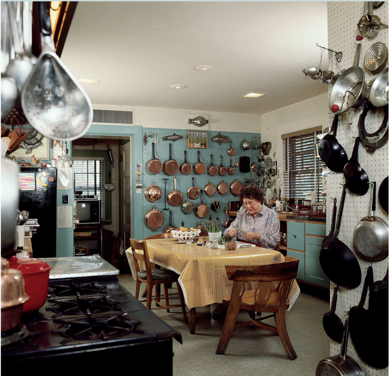
Photo Credit : Jim Scherer
Julia’s Child’s Cambridge Kitchen
More than twenty-five years ago, I wanted to write a book on the kitchens of noted food authorities. I contacted Julia Child first, because her address was listed in the Smith College alumnae directory and I was a fellow alum. According to her friends, I could just as easily have found her address through directory information, since she had a listed telephone.
I thought the postcard she sent in response was amusing. Though I was an architect who had designed or remodeled numerous homes and kitchens, I did not think the card applied to me. In fact, I considered myself a decent cook and was curious to see what Julia’s kitchen looked like. In those days, it had not yet been the setting for a TV show.
A few months later, on a cold winter morning, I came to the back door of her Cambridge home, as instructed. Soon I was in her warm, cozy kitchen. Julia introduced me to Jim Scherer, the photographer whom I had engaged at her suggestion. She was welcoming, smiling, and charming. With professional makeup and carefully coiffed hair, she was absolutely ready for an interview and photographic shoot. Nevertheless, she gave us a mock warning: “Don’t photograph the chef in tennis shoes!” They were sparkling white.
As I looked around, Julia said, “People are always surprised my kitchen is not more high tech.” Actually, I had imagined it would resemble one of the glamorous sets on The French Chef. My first thought was, “Where is the island? Julia Child always works at an island.” I admit now to being a little disappointed. I had been fooled by the illusion of TV. What I saw instead was a smallish, old-fashioned, eat-in kitchen with cluttered countertops and cabinets seriously in need of painting. By then it was nearly thirty years old—and it looked its age. Yet, the more I looked around, the more I realized that it was a fascinating and important place, with its old stove and its batterie de cuisine, with what looked like thousands of glistening cooking implements close at hand. It was a very comfortable and welcoming workroom full of carefully chosen tools and fixtures. Here are some of the most important things I noticed that day.
Julia’s Child’s Cambridge Kitchen Layout
Table
The kitchen’s center of gravity was the table. It and the chairs had been acquired in Norway, where Julia’s husband Paul, a foreign service officer, had once been stationed. As we began the interview, Julia invited me to sit down at the table and offered me a perfect cup of French coffee, with cream and sugar. I mentioned that cream was not an option at my in-laws’ home. She huffed, “Where are you staying, with fanatics?” She then proceeded to expound on her views.
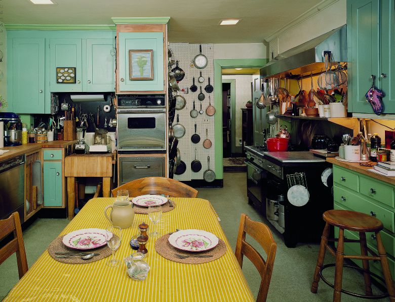
Photo Credit : Jim Scherer
At times we walked around, examining a cooking gadget or something on the counter while I made notes. Mostly though we sat at her comfortable table, which was covered with a very practical oilcloth. The table was her supplementary work area. At one point during the photo shoot, Julia sat down and began peeling asparagus. So many of our modern kitchens require us to stand all the time or, at best, to perch on a barstool if we need to sit. But Julia could sit down comfortably to complete a task—without leaving the kitchen. As we will see, that same table also provided the setting for thousands of meals with friends and family
Batterie de Cuisine
The racks and shelves of the batterie de cuisine housed an extensive collection of metal cooking implements. Upon entering the room, it was the most striking thing in Julia’s kitchen. Glistening ladles, pans, and strainers framed the doorway. In the distance were gleaming copper pans, carefully arrayed (and cleaned weekly by an Irish lady, Mrs. Crawley). Paul and Julia had fine-tuned these arrangements to be as practical and as aesthetic as possible. A decorative item, such as a fish-shaped mold, might provide a sort of visual “cap” to a particular composition.
Most of the implements were mounted on pegboard, on which Paul had painted outlines of the pans so that they could be replaced in their proper positions. To avoid mistakes involving items of the same shape but different colors, little Polaroid pictures were attached to the pegboard as well. After all, this kitchen was used not only by Julia but also by her many assistants, who experimented with dishes and prepped food for various TV shows. When I asked if anyone ever moved an item from its appointed place, she said firmly, “You don’t.”
Although many people mount their kitchen equipment on pegboard or more modern types of racks, Julia’s kitchen was unique. Her batterie de cuisine encompassed the areas around the sink, stove, and pastry counters. Her pantry also featured pegboard, as well as a high shelf for baking dishes. Special hooks on the pegboard could be used to hold very small shelves.
According to Nancy Verde Barr, author and longtime Child assistant, it was easy to find things in Julia’s kitchen. All her spices and dry herbs were arranged alphabetically. For cooking, she used copper pans as well as nonstick skillets, Revere ware, and cast-iron skillets. Much of Julia’s equipment was purchased at E. Dehillerin, in Paris, a treasure trove for serious cooks.
When it came to home kitchens, Julia disliked the sleek, clutter-free, modern look. Many architects of the time favored all-white cabinets with an industrial aesthetic. A longtime friend of Julia’s, Pat Pratt, said vehemently, “Julia hated those kitchens! We visited several of those kitchens together. Julia thought they were just hopeless. They were so bare. Not even a kitchen towel on the counter. . . . A kitchen is a place to do things!”
Overhang
Overhang—the distance a kitchen counter extends beyond the cabinet below—was very important to Julia. In fact, she mentioned it to me on the phone when I initially called to make my appointment. With some emotion, she noted that some architect-designed kitchens had “no overhangs at all!” This made it harder to neatly brush food particles from the counter. While the standard kitchen overhang is 1 inch, her recom- mendation was 2½ to 3 inches. Interestingly, the overhangs in her kitchen appeared to be the standard 1 inch.
Countertops
The main kitchen had butcher-block counters. They were obviously well used, with visible incision marks. Major cutting or chopping, however, was done on separate cutting boards, or on the big chopping block near the double ovens. Julia said she cleaned the countertops with an abrasive cleanser; when they dried, she seasoned them with olive oil. (Butcher-block manufacturers recommend other approaches.) According to Nancy, the counters would sometimes be cleaned with a cut lemon. “It was never a fussy item,” Nancy said.
The counter height was 38 inches (the standard height is 36 inches). Because Julia stood over 6 feet tall, this extra height was a necessity for her. And although I thought that her countertops seemed very cluttered, she said emphatically, “Others might need more. I only need this much.”
Stove
The Childs purchased the restaurant-style gas range from a friend in Washington, D.C. When Julia first saw it, she said, “That’s for me!” The Garland stove was initially installed in their Georgetown home at 2706 Olive Avenue, and it eventually made the move to Cambridge. Julia liked the fact that the burners came apart for easy cleaning. The stove also contained a salamander for quick broiling.
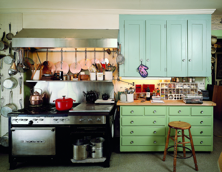
Photo Credit : Jim Scherer
According to assistant Stephanie Hersh, “Julia’s restaurant stove was one of her favorite pieces of equipment. To the right of the burners was a grill top. She rarely used it, and kept it covered with a specially made cover that was like a bench top. She stored some utensils on it and often rested pans in that ‘set aside’ area. Immediately below that grill top was the salamander.”
Garland does not recommend these ranges for home use today. A true restaurant range produces more heat than the typical homeowner needs, and must be vented with a powerful hood. Additionally, the unit itself can become quite hot, so the surface to which it backs must be able to withstand high temperatures. Wolf and a number of other companies make commercial-style ranges for home use. In several of the color photos, you can see that Julia kept many implements, such as whisks, strainers, and ladles, near the stove. The copper lids were particularly useful for a quick cover.
Refrigeration
Julia had access to several modes of refrigeration. Rather unusual for the time, she had an undercounter freezer in the pantry. According to Stephanie, “It was for general use. There was everything from ice cream to vegetables, stock, dough, nuts . . . there was also a refrigerator/freezer in the basement laundry area that was used when we needed extra space . . . mostly during TV shoots.” Near the sink was an icemaker. Again according to Stephanie, “Julia used a lot of ice! Mostly for food preparation and some for cocktails.”
Paul painted the main refrigerator black. Julia said, “It’s more chic, don’t you think?” While it is easy to dismiss Julia’s kitchen as simply practical, she and Paul seriously considered its aesthetics. In the days before both paneled and counter-depth refrigerators, painting the white bulky object black helped make it less intrusive.
According to Nancy, the unit was a combination refrigerator/freezer. Unfortunately it had a loud hum. When TV shows were shot in the kitchen, the refrigerator had to be unplugged. The cameramen would store their extra gear in the freezer so that they would remember to plug the refrigerator back in. They knew they would not forget their photographic equipment.
Work Triangle
The so-called work triangle is an imaginary one, linking the main work zones of a kitchen: refrigerator, sink, and stove. This concept originated in the 1940s as kitchen design became more codified. One rule of thumb specifies that the individual sides of the triangle should be between 4 and 9 feet long.
I did note that the refrigerator was rather inconveniently placed, requiring some extra steps from the sink. When I mentioned that the arrangement did not conform to the work triangle that architects generally followed—sink between refrigerator and stove, usually linked by counters—Julia said, “I don’t pay too much attention to that.”
Sinks
Julia had a stainless steel double sink, with stainless steel double drain boards; it came with the house. She said two sinks were necessary: one for foodstuffs, the other for dishes. The drain boards, she noted, were more efficient and attractive than plastic ones, which “never drain properly.” There were numerous labels near the sink, instructing assistants not to put celery or onion peels in the disposal. The tools that Julia used in that area were, as usual, close at hand. Knives, bottle openers, and strainers were carefully arrayed on the wall, attached with magnets. Her friend Pat Pratt said, “Julia never put knives in drawers because they would get dull there.”
Small Equipment
Julia loved time-saving gadgets. She called the Cuisinart “one of the great inventions.” As for the microwave oven, she said that she “never cooked with it, but would not be without it.” When I expressed a slight fear of microwaves, she said that was “silly.”
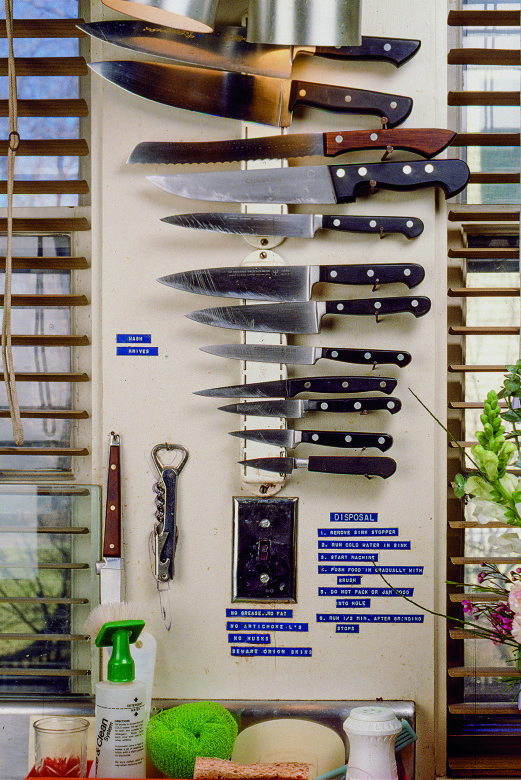
Photo Credit : Jim Scherer
According to Stephanie Hersh, “Julia was a gadget and knife ‘freak’ (her word, not mine).She loved having kitchen tools for every purpose. As far as Julia was concerned, you couldn’t have too many. She adored her food processor, but also had almost every kitchen tool ever invented—in every size, shape and color! The drawers and cupboards were filled with tools that peeled, chopped, sliced and diced. There were bottle openers of all sorts and oyster shuckers, scoops, cutters, temperature gauges … you name it, she had one.”
Pantries
Julia had three pantries. One was near the kitchen entrance. That one contained large pots and other implements that were rarely used. Two adjoining pantries linked the kitchen to her elegant dining room. One of those pantries was for pastry, the other for dish and glassware storage (it also served as a bar for mixing drinks).
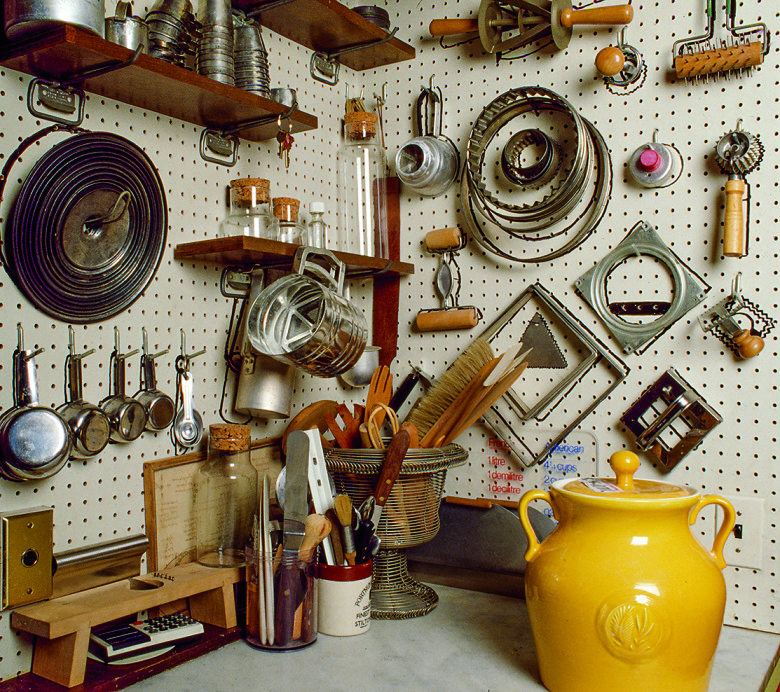
Photo Credit : Jim Scherer
The pastry pantry had a marble countertop for rolling out pastry dough, and the previously mentioned undercounter freezer. Removed from the main cooking realm, this area was cool and dark. Various pastry molds, dough cutters, and flour sifters were readily at hand, along with numerous rolling pins, a scale, a second food processor, and another microwave oven, which Julia used primarily for warming butter or quickly thawing pastry. A high shelf was used to store large metal cooking pots, casseroles, baking dishes, and trays. This architectural feature was common in the Childs’ European kitchens as well.
The glassware pantry included a sink as well as implements for serving wine and mixing cocktails, all under a poster warning citizens of the evils of alcohol. The Childs also had a wine cellar in the basement, and a wine rack in the rear pantry.
Julia kept her better porcelain in the same pantry with the glassware. Some of it was from Provence, and she occasionally used pieces in her TV shows. Assistant Nancy Barr would sometimes stand on the counter, waiting for instructions on which plate to retrieve. “Give me the yellow one,” Julia might trill.
During my visit, I noticed with some surprise two opened bags of Pepperidge Farm cookies on that same counter. When I asked Jim about it later, he said it was not a fluke: Julia liked those cookies, and was very fond of McDonald’s french fries as well.
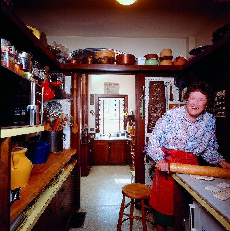
Photo Credit : Jim Scherer
Floor
Here Julia made two emphatic points: “It should be soft underfoot, and should be a neutral color.” In an earlier kitchen in France, Julia had a red ceramic floor that she said was beautiful, but impossible on the feet. She covered it with a resilient floor. In another house, she replaced a black and white floor that showed every drop that fell. Julia’s Cambridge kitchen had a linoleum floor that was cleaned regularly. According to assistant Stephanie Hersh, Julia “had a lovely team of cleaning ladies who came once each week to scrub the entire house from top to bottom (kitchen, dining room, pantry, all six bedrooms, three full bathrooms, three half bathrooms, and lots of other living space!). The house always sparkled.”
When the kitchen was being taken apart for transportation to the Smithsonian Institution, it was discovered that the floor had an asbestos-containing adhesive. Though common in Julia’s day, such adhesives are now considered a hazardous substance, so the original floor did not make the trip. Its pattern was photographed instead, then reapplied to paper for the Smithsonian installation.
Lighting
An appealing aspect of Julia’s kitchen was the task lighting—light applied where needed. She had some incandescent recessed lights, along with wall lights and fluorescent under-cabinet lights. Incandescent bulbs produce a yellowish light that was popular in Julia’s time. Unfortunately, that type of lighting is only 10 percent efficient; 90 percent of its output is heat. Since 2014, the U.S. government has banned the manufacture of most incandescent bulbs. Today they are being replaced primarily by LEDs (light-emitting diodes) or compact fluorescent fixtures.
Windows
The kitchen had three double-hung windows, facing roughly north or north- west and hung with venetian blinds. Although these windows provided sufficient daylight, other iterations of Julia’s Cambridge kitchen enhanced their effect. When the room became a set for Julia’s TV shows, decorative window treatments were added, while gels and outside lighting gave the illusion of sunlight streaming in. In the movie Julie and Julia, the kitchen windows also look sunnier than in real life. And the Smithsonian installation features theatrical lighting that creates the effect of dappled sunshine.
How the Cambridge Kitchen Was Designed
When the Childs relocated to Cambridge, Paul was fifty-nine and retired from the government. Their home in Massachusetts put them near some good friends who were writers and Harvard professors. Julia had been working on Mastering the Art of French Cooking for nearly a decade, and hoped it would sell. Nevertheless, she expected to teach cooking lessons to supplement their income.
They moved into the house in 1961 and immediately began remodeling their kitchen. Mastering the Art of French Cooking was published in the same year to instant praise. Julia’s TV show, The French Chef, premiered in 1963. The room that was originally intended to be a retreat would soon become a busy place as Julia wrote more books, appeared on other TV shows, and became a national celebrity. Despite Julia’s immense fame, she would not remodel the kitchen again. Other than new lighting and a temporary island used in some TV episodes, the old-fashioned kitchen remained unchanged over the years.
A 1970 edition of Architectural Graphic Standards, the reference book that architects use for basic dimensions and requirements, shows that the typical kitchens of that time were galleys, either L-shaped or U-shaped. The illustrations show no tables in the kitchen, and no free-standing islands. Little arrows on the plans bear the label, “to d.r.,” to dining room.
So the concept of the kitchen as a separate room from the eating area was still common, eight years after Julia and Paul finished remodeling their kitchen.
The Childs had purchased their house in Cambridge in the late 1950s. They liked its large cellar, upstairs office space, two living rooms, and the large airy kitchen with two pantries. Within twenty minutes of seeing the house, they were determined to buy it. Yet they did not take up occupancy until the summer of 1961. For the remodeling, they engaged Robert Woods Kennedy, a well-known Boston architect who had written for the New Republic.
According to Julia, this was the ninth kitchen she and Paul had remodeled. In Julia’s words, it was to be “practical and beautiful, a working laboratory as well as a living and dining room.” The structural changes were minor. They retained the original cabinetry but shifted some functions around, such as moving the sink under the windows. One window was covered up, pegboard was mounted for storing Julia’s copper pans, and a special niche was created for the chopping block. The old Garland stove was shipped from Washington and installed with the rest of the appliances. Lights were added over the raised butcher-block countertops, and a hood with two exhaust fans was mounted over the stove. Since Julia hated ceramic tile flooring, she and Paul selected heavy vinyl, a type that had been used in some airports at the time.
Although most implements were stored with practicality in mind, Julia mentioned that she and Paul also appreciated the shapes of various tools. Thus olive pitters might be placed near bottle openers, while knives were arrayed in graduated sizes on the magnetic holder. Paintings from friends and photographs by Paul were carefully arrayed on the walls, as were flan rings, pot lids, and skillets. To design the batterie de cuisine, Julia placed all her pots and pans on the floor in the arrangement that she wanted. Paul then drew their outlines on the pegboard. By the end of February 1962, the renovations were finished. Julia called the kitchen the soul of their house, “a real wowzer, a very functional space and a pleasure to be in.”
Julia’s restaurant range and batterie de cuisine set her kitchen apart from others of the time. The extent of the butcher-block counters was also unusual; a more common arrangement would have included a butcher-block cutting board atop the dishwasher.
Paul selected the color scheme: periwinkle blue, lime, and black. Bright colors were popular in the 1960s. A 1962 Frigidaire advertisement shows a kitchen with all pink appliances, including the washer/dryer, and a green resilient tile floor. The Childs were proud of their kitchen, considering it not only practical but also beautiful. But what is beautiful for one generation may seem dated to the next. When asked about Julia’s kitchen at the Smithsonian, most people only observe that, “It is very practical.”
In Julia’s Kitchen: Practical and Convivial Kitchen Design Inspired by Julia Child by Pamela Heyne and Jim Scherer published by ForeEdge, an imprint of University Press of New England. upne.com


She was the best cooking instrutor of all times, even the many cooks of today
I appreciated the references the author made to kitchens of the same period. However, I wish the publication would have chosen a writer with more respect for Julia Child. She is responsible for changing the way Americans cook and eat! Instead, It’s obvious the writer enjoyed poking fun at her throughout the work. Such a shame!