


Farmhouse Style on A Budget | New Hampshire Home Tour
Bre Doucette finds farmhouse style interior design solutions outside the box for her home in Candia, New Hampshire.
By Annie Graves|Feb 22 2018|![]()
Coffee By Design | Portland, Maine
Photo Credit : Katherine KeenanBre Doucette’s farmhouse, built in 1846, would be scarcely recognizable to its original family, but its breezy style and witty design solutions have become familiar to more than 100,000 monthly online visitors. “I started decorating when I was 13,” says Bre, smiling, as she stands in the kitchen of the Candia, New Hampshire, home. “Sometimes I would change the look of my bedroom three times in the same afternoon. I just had to get it out.”
Photo Credit : Keller + Keller
These days, an avid audience regularly checks out Bre’s blog, Rooms for Rent, along with her Pinterest and Instagram postings, to see what she’s changing next, and how she’s doing it. Is she repainting the kitchen island? Adding bold pillows to the slipcovered couch? Tweaking the flowers on the dining room table that her husband, Jesse, built and that she stained to beachy perfection? Or building an outdoor patio to offset their newly shingled barn?
“I was always creating vignettes on my dresser,” says Bre, now 32, “always drawing room sketches at school.” When her parents bought an early Gateway computer and told each of the kids they could pick one game for it, Bre chose interior design software. “My parents said, ‘It’s not really a game,’ and I said, ‘Well, it is for me.’”
The game became reality in 2011, when Bre and Jesse bought the Candia farmhouse. It had been updated by a contractor who wanted to flip it, so the basics—including new plumbing and electrical—were in place. And with two acres abutting 100 acres of conservation land, there was plenty of room for the couple’s two young children, Carter and Dannika. “When we found this, we just knew,” she says.
But while they loved the character of the house, “at the time it was a lot of brown, mustard brown, and more brown inside,” she says. “The house felt covered up. I wanted to use colors that would complement the interior, instead of just being something to put on the walls.”
A year later, Bre started blogging about the details: the colors she was trying out, the bargains she was finding, the fun of it all. “With the blog, all of these dormant ideas were coming out. All the dreams I had as a kid could be expressed, and there was a community that soaked it up.” The beautiful results—a style that Bre calls “clean farmhouse”—brought both subscribers and sponsors.
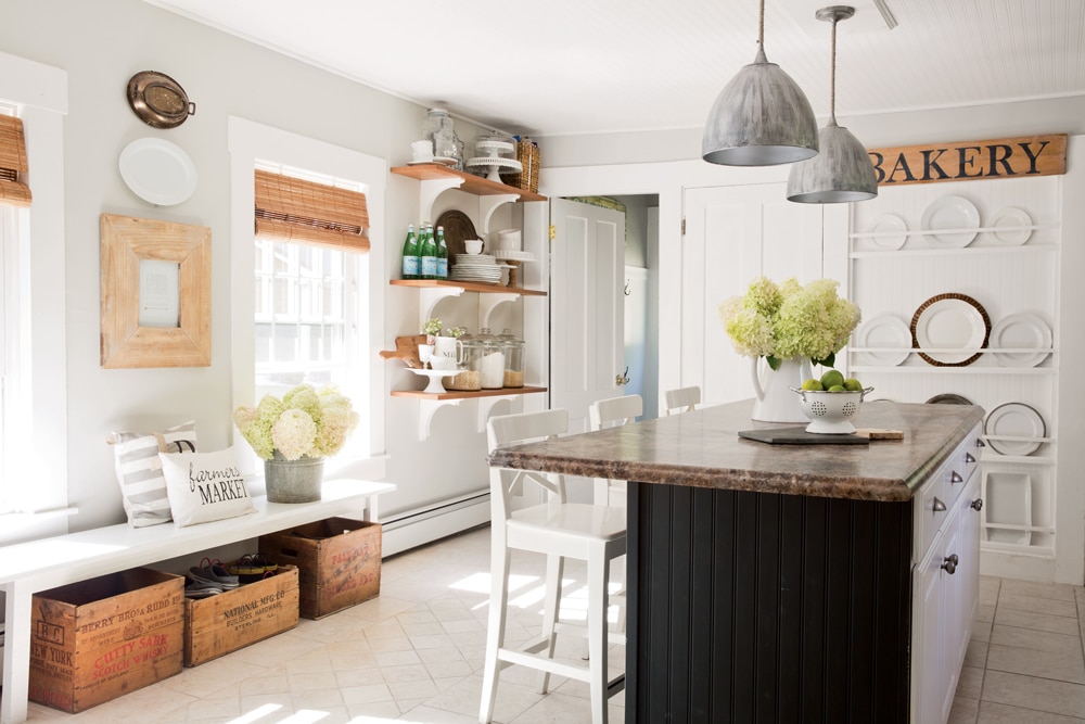
Photo Credit : Keller + Keller
Today, the first thing you notice upon entering the light-soaked kitchen is a floor-to-ceiling dish rack filled with white ironstone platters and weathered cutting boards. “It was just a blank wall, bowed out because the chimney behind it had settled,” Bre recalls. “It drove me crazy because we had three doors lined up on that one wall: bathroom, basement, and back hallway. I wanted to do something that felt like it had always been there, and to distract from the wall of doors. It took a year to convince my husband—it was a big job. We had to cut out the chimney!”
The rack is backed with beadboard; thin strips of wooden screen strapping create the rails. “I didn’t want anything too heavy,” she says. “The wall felt heavy enough, with all those doors.” Beadboard wraps the kitchen island, too, and repeats as the backsplash. And to make the stock cabinets seem less “stocklike,” the couple attached corbels—which also brace the open shelving added near the back entry after every other attempt at placing furniture there blocked the doorway.
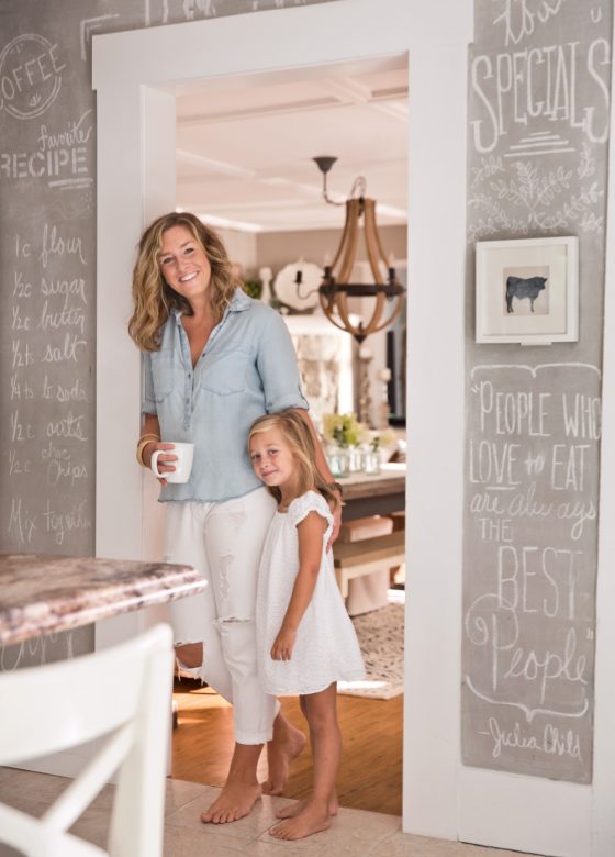
Photo Credit : Keller + Keller
An entire wall of gray chalk paint, which Bre mixed herself, evolved as a solution to another problem: The wall abutting the dining room bumps out, creating a wall on two planes. “I wanted to turn this quirky thing into something that looked purposeful and was pretty as well,” she says. “I’ve grown tons in figuring out how to disguise unsightly things.”
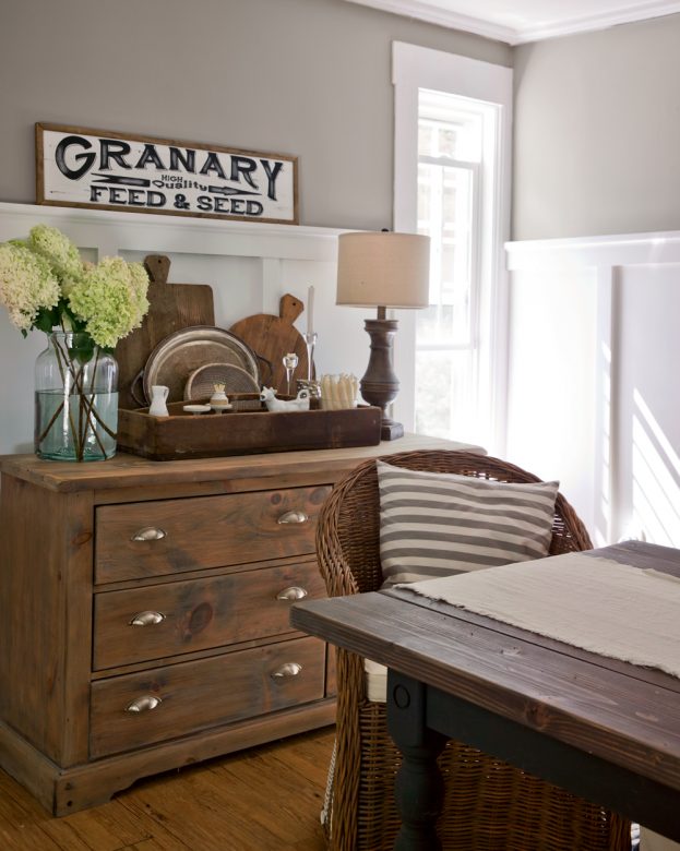
Photo Credit : Keller + Keller
With each lesson Bre has learned, her readers have gained insights into thinking outside the box. Even clutter offers creative opportunities. Vintage wooden crates stashed under Jesse’s hand-built kitchen bench hide the kids’ boots and shoes; in the kitchen’s back entryway, hooks are hung at two distinctly different heights, with numbers stenciled beside them. “I wanted it to feel like an old schoolhouse,” Bre says. “Every day, the first thing my son does when he gets home is hang up his jacket and backpack and put his shoes away.”
The kitchen flows effortlessly into the dining room, which is the only room that hasn’t been repainted more than once. “It feels like it’s the color it was always meant to be!” Bre exults. But she points to a once-problematic jog that Jesse retrofitted with a woodstove, hearth, and mantel. “It was a funky corner in the dining room—we always thought that somewhere down the road, we’d have to square it off. But a few months after we moved in, he decided we needed a woodstove, and it was the perfect place to put it.” That first winter they lost power eight times, so the solution was pretty and practical.
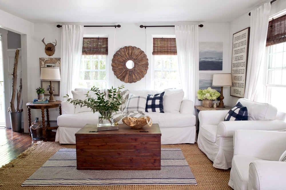
Photo Credit : Keller + Keller
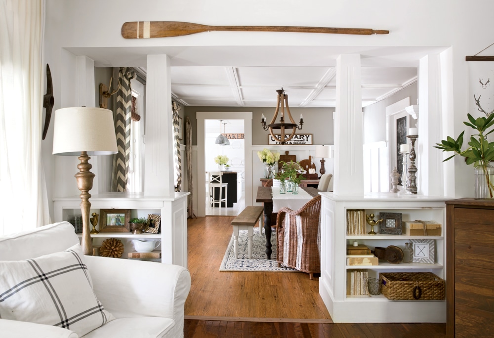
Bre indicates the half walls topped with columns that divide the dining and living rooms. “This was the selling point for me,” she says. The feeling of open space, the uncluttered style … it’s an oasis of calm. “Weathered wood, white, and anything slipcovered—it’s what I’m known for.”
Yet we’re also in the presence of a wealth of how-to projects and low-cost fixes. Bre sanded and restained the coffee table (built by Jesse’s grandfather), stenciled a faded Union Jack flag on the corner table (made by Jesse), fashioned a coatrack from a piece of driftwood, and even painted the two dreamy abstract landscapes beside the couch (“I’m not a painter, but I think I just found a new hobby”).
Photo Credit : Keller + Keller
And yes, the tutorials appear on her blog. You, too, can affix barn boards to the wall behind your bed to create a headboard. Paint stripes on drop-cloth curtains. Make a farm table from two-by-sixes. Bre’s advice, widely applicable, is “Keep going until you see what you like.”
She points to the master bedroom’s “Rooms for Rent” sign, the one that inspired the name of her blog. Made by Pottery Barn, the sign was originally priced at $229. Bre kept an eye on it until it landed in clearance for $30. “Anyone can decorate, and it doesn’t have to be expensive,” she says. “It’s knowing where to look and what to find. That sign represents my passion: decorating rooms with ideas that people can ‘rent,’ in a manner of speaking. This house, with its dilemmas, forced me to look outside the box for solutions—that’s been my journey with it.”
She pauses, and looks around the airy farmhouse kitchen. “I wouldn’t change one thing about that.”


Always enjoy seeing New England farm home designs, as I live in one. But. Being critical whey are they always done in white?? Every thing is in beautiful white… but I have colors and lots of them. I like colors. So, give us some old places with lots of stuff/nautical/ well traveled possessions and lots of them. How to enjoy all your treasure collected over years. Hand me downs from older generations etc. Grown kids stuff left behind or in my case returned to me to hold on to… see where I am going??? So, help!! Thanks
We have owned an1836 farmhouse for 34 years in central Massachusetts. It is a working farm and white doesn’t work for us either. The “modern farmhouse” design is white but the authentic is not. Wide pine floors, painted wainscoting, solid doors with thumb latches and even wallpaper work.