There’s a story that Kelly McGuill’s two sisters like to tell about their childhood in the pretty Boston suburb of Newton, Massachusetts. It was 1970, their parents had granted them half the family’s garage to use as a clubhouse, and as the first step in decorating, Susan and Renee unrolled their
Partridge Family posters.
No! 10-year-old Kelly insisted.
No posters: Only pure-white walls and floors, with repurposed shutters framing the interior windows, and only Susan’s original artwork on the walls. (Today she continues to work as an illustrator, under her married name, Susan Farrington.) “I’ve always, always, loved white and neutrals,” McGuill says.
Today, the nuts-and-bolts of Kelly McGuill’s life are anything but tidy. Mother to two teenaged sons, she’s also a professional stylist and interior decorator. And yet, when she brushes in through the front door of her home in Walpole, Massachusetts, she sees only pure, clean shades of white–bright and glossy in one corner; matte and creamy in another; chairs washed with white and gray undertones; and in the kitchen, luminous marble countertops, veined with taupe and eggplant. It’s a celebration of neutral colors — the most serene and pristine of hues.
“I use so much color for other people in my work,” she says, “but in my own home, I find white completely irresistible. It gives a sense of contrast and drama, but it also really lets light in, so it ends up bringing in such warmth.”
Warmth isn’t all that flows into this five-bedroom Colonial-style home, which McGuill built with her husband 20 years ago. Between her kids’ pals coming to play basketball, family visiting on weekends, and friends over for the McGuills’ storied dinner parties, the flow of bodies is relentless. “We have a lot of family, and we’re centrally located among all of them–so we get a
lot of company,” she chuckles. If that, combined with all that pale decor, seems like a recipe for disaster, McGuill doesn’t seem to notice.
“I don’t police the house,” she explains. “I’ve always found that white is easy if you just follow certain rules.” One of her most reliable tricks when decorating with neutral colors is to use only washable paints: “To me, the worst thing is to have anything in your house you have to constantly worry about. I want to relax in my own home.”
Another peace-of-mind strategy: Knowing when to say
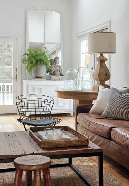
when. White may be the home’s unifying theme, but the family room is the most well-used in the house, and all the furniture has to be kid-friendly. “Those leather couches have been a godsend,” she explains. “Every spill or scratch just seems to make them more like your favorite bomber jacket from high school. Jute rugs are amazingly forgiving. They darken with age but tend to hide spills. Although the white accents keep the room from getting too dark, I made sure that none of the furniture fabric was actually white.”
Against all the white and neutral colors, McGuill has also managed to make the whole combination interesting and surprising. “I love contrasts,” she explains. All around, she plays with textures: old and new, dull and shiny, scratchy and smooth, wood and metal. She also layers in patches of bright color: A white paint-washed bureau stacked with wire baskets, for example, is a place to display seasonal accents such as yellow- and green-flecked gourds and plump orange pumpkins.
You might–assuming you’re not a natural designer–look at rooms like this and wonder,
How does she know what to buy, what to throw away, and how to put it all together? The
Partridge Family episode points to a natural inclination; the rest came through practice. After college, McGuill worked as a salesperson for a brick company, and her clients were architects and contractors. She learned the language of the business and read design books and magazines. When she and her husband, Matt, redid their own home, friends began asking her for help with theirs. She picked up work while raising her sons, and as they grew, she received referrals for new clients and took interior-design classes at local schools. Soon, her clients’ homes were being featured in design magazines, which led to more work as a stylist.
“I’ve always felt that design and style came instinctively to me,” McGuill says. “I’ve always been able to walk into a space and start figuring out how I would change or add things. I loved some of the design classes that I took, although others left me feeling as though I were being told what to do.”
An eclectic swirl of styles is at work in the living room, where the tables are deliberately worn–as they are throughout the house–to a weathered patina. “We chose them that way, so a few more scratches or dings won’t ever hurt them,” McGuill says. In fact, aged-to-perfection surfaces are found in almost every corner here. Against one wall sits a giant mirror crisscrossed with elegant, cathedral-like framing that McGuill unearthed one year at the Brimfield Antique Show. “It’s one of my favorite things in the house,” she says. “It just opens up the room.” Brimfield is a major source of inspiration. McGuill rhapsodizes about “stumbling on unique pieces that don’t look like much at first–vintage bird prints for $5 apiece, say–and creating galleries out of them that I know I won’t see in any home-furnishings catalogue.”
Hazy washes of light pour in through the sunroom just off of the all-white kitchen, where McGuill sits at the table. She’s thinking about color again, or the absence of it. “Every piece of artwork or furniture comes to life with white,” she says. “Even when you paint furniture white, it takes on a certain place of importance. When all of these elements work together, nothing stands out, so everything flows.”
There’s more evidence just to her left, in the dining room–the only room without white walls, yet it continues the flow with light-taupe walls and mismatched ironstone ceramic pitchers. “I wanted a little less of a country feel in here,” McGuill explains, walking over to her shelves. “Bringing in different eras and feelings can be just as effective as bringing in different textures and colors.”
That might be the best explanation for the funky retro-’50s sign that spells out “GUESTS” in neon letters. A score that McGuill found at a bed-and-breakfast in New Jersey years ago, it’s a fitting emblem to hover over a dining room that feeds so many friends and family members. And even though it couldn’t be more stylistically different from so many natural, rustic things around it, it still works within the mix: the sign’s hot glow against the cool walls, the smoothness of the glass against the worn table.
“The way we live, nothing is off-limits,” McGuill says. “I love design and I love our home, but most of all, I love the people in it.”


